As users’ life becomes more hectic, more people start gravitating towards simple, compact, small, yet more powerful devices. Gadget manufacturers and application developers cannot disregard the growing tendency towards downsizing and miniaturization.
As a result, smaller devices and less demanding apps now make massive inroads into the consumer computing market. It’s more convenient and easier for a regular user to reach out into the pocket and pull a small smartphone, which is essentially a mega-powerful computer, out of it.
Not only individual users, but also a lot of industries are now more stringent than ever in weight and size requirements. They are in a greater need of tools, techs, and devices that are small, wieldy, and highly effective.
No wonder there is a boom in demand for nano-solutions, embedded software development, microchip-based technologies, and the like. And with the downsizing trend, there comes a need for designing comfortable and lightweight tools complying with the major laws of ergonomics.
Since building convenient devices is a natural concomitant of the downsizing trend, there is also a need to create more convenient and uncluttered apps. Today’s post is concerned with the general recommendations that can help you create a successful ergonomic app design.
One Size Doesn’t Fit All
With the personalization of computing devices, there is a considerable increase in the number of changes in UX design. It’s obvious that people’s hands are of different sizes, which calls for tweaks in tablet and smartphone design.
Factor in different dexterities, handedness, and thumb grips, and you might think that it’s necessary to adapt every gadget for each individual user’s needs. Since it’s impossible and impracticable in today’s world, developers try to make their solutions universally convenient.
When designing a new app, they keep such things as buttons and elements, which enable customers to take actions on a device, and position them in the way that allows the most convenience. So, the user can be sure that no matter the situation, they won’t have to reach, zoom out, or search for something in order to perform a certain task.
Usability Defines Successful UX
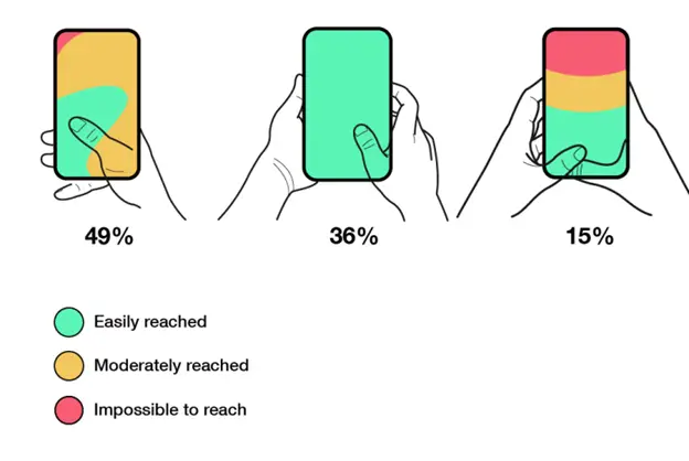
As with any app, your solution is bound to have areas which are easy to reach and hard to reach. There are also moderately reached areas. And it’s critical that you take this into account when working on your app.
First things first, you should pay attention to the bottom area of your app. It’s always within easy reach, so make sure to place the most important tools there. These are the tools that usually help users easily navigate the app and access the most important features. Consequently, the least important should appear at the top of the screen. Check out the most hyped apps to make sure it’s true.
Conversely, desktop programs utilize completely different schemes here. If big screens are concerned, it’s wise to place buttons, menus, and other important elements that help you carry out an action at the top of the screen.
Using a keyboard on screen is another thing you want to think about. Professional app developers now tend to shrink the size of the keyboard when creating apps for portable devices. In doing so, they ensure that their users can easily type using a single hand.
When Bigger is Better
When designing apps for small screens, we can’t afford to include tiny elements like icons and tools, as it was with desktops and their big screens. Since a user can’t rely on a good old mouse to click on a certain element and select a certain option, you need to allow them to do this using their own fingers. Though being a universal tool, human fingers can’t compete with a mouse in terms of precision and accuracy. Therefore, designers should ensure that the size of their app elements lets users target the right part of the screen to perform the needed action.
Perfect UI
When it comes to designing a user-friendly and smooth interface for your app, there is always some room for improvement. Along with the aforementioned characteristics, your UI should facilitate easy and comfortable navigation and be pleasing to the eye.
To hit on the best layout and size your app elements properly, it’s necessary to put in enough time and resources. Still, as professional app designers note, a good interface is uncluttered, yet a perfect one is invisible.
We’ll bet you’re familiar with the frustrating experience of having tons of features in your app but not knowing how to utilize them to your benefit. So, in the majority of cases, less is actually more when it comes to designing a user-friendly interface. If you know that most of your users won’t be using this or that tool or feature, don’t even bother to include.
What’s more, some apps, including real estate, vacation rental, or video streaming apps, can benefit greatly from the ability to hide its interface. If you’re designing a similar app, you want it there for just a couple of seconds, seconds and then fade out, thus filling the whole screen with useful content. As you see, a well-thought-out interface design and a good understanding of app ergonomics will make for a great mobile user experience.


