


The world of Game of Thrones is renowned for its intricate storytelling, larger-than-life characters, and immersive fantasy realm.
Beyond the captivating narrative, the visual aesthetics of the series play a crucial role in bringing the story to life. Typography, in particular, holds immense significance in capturing the essence of this epic saga.
This article will explore and celebrate the best Game of Thrones fonts that have become iconic symbols of this beloved franchise.
Best Game of Thrones Fonts To Embrace the Mythical Realm
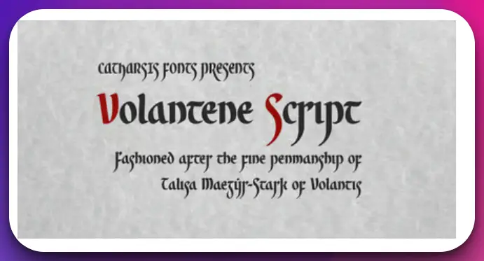
1. Valyrian Script
Valyrian Script (Download Here) is undoubtedly one of the best Game of Thrones fonts that captures the mystical essence of the epic fantasy series.
With its intricate and ornate design, this font transports readers into the enigmatic world of Valyria.
The beauty and complexity of the Valyrian Script lie in its rich calligraphic strokes and unique letterforms.
Every character is meticulously crafted, invoking ancient power and magic. It is a testament to the Game of Thrones universe’s creativity and attention to detail.
This font has become synonymous with the Targaryen lineage and the legacy of dragons. It embodies the elegance and grandeur of House Targaryen, whose sigil features a three-headed dragon.
The Valyrian Script is often used to transcribe the High Valyrian language, spoken by the Targaryens and other noble houses.
When incorporated into Game of Thrones-themed designs, the Valyrian Script adds authenticity and authenticity, enhancing the overall visual appeal.
Whether it’s posters, merchandise, or digital media, this font brings a touch of mysticism and intrigue that fans of the series can instantly recognize and appreciate.
In conclusion, the Valyrian Script is one of the most captivating and distinctive Game of Thrones fonts.
It’s intricate design and connection to the Targaryen lineage make it a powerful tool for immersing oneself in the world of Westeros.
So, if you want to bring a slice of the Seven Kingdoms into your design projects, Valyrian Script is undoubtedly a top choice.
2. Trajan Pro: Timeless Elegance and Regality
Trajan Pro (Download Here) is one of the most recognizable fonts associated with Game of Thrones. Inspired by the ancient Roman letterforms, Trajan Pro exudes a timeless elegance that perfectly complements the grandeur and regality of the series.
With its meticulously crafted serifs and noble proportions, this classical typeface has become synonymous with the Game of Thrones logo.
Trajan Pro’s strong vertical lines and refined curves create a sense of authority and power, reflecting the epic nature of the show. Its versatility allows it to be used for various applications, from promotional materials to merchandise.
The font’s inherent sense of grandeur captures the essence of the Seven Kingdoms, their intricate politics, and the larger-than-life personalities of their characters.
3. Baskerville: Subtle Sophistication and Intrigue
In Game of Thrones, where political intrigue and complex characters reign supreme, Baskerville (Download Here) emerges as a font that embodies subtle sophistication.
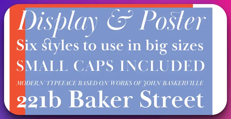
With its elegant curves and balanced letterforms, this classic serif typeface adds a touch of refinement to the series’ visual identity.
Baskerville’s restrained elegance captures the nuances of the intricate webs of power and deceit that define the Game of Thrones narrative.
Its legibility and readability make it an ideal choice for subtitles, captions, and body text within the show.
Whether it’s conveying the conversations in the halls of power or the secrets whispered in the shadows, Baskerville sets the tone for the series subtle yet captivating moments.
4. Targaryen
Targaryen, known for their fierce dragons and indomitable spirit, has left an indelible mark on the Game of Thrones universe.
It is no surprise that the Targaryen font is considered one of the best Game of Thrones fonts available.
This font exudes a sense of regality and power synonymous with House Targaryen.
The elegant and intricate letterforms of the Targaryen font embody the dragon’s majestic presence. Its bold, sweeping curves and sharp edges evoke the fiery determination of Daenerys Stormborn and her ancestors.
When employed in Game of Thrones-themed designs, the Targaryen font immediately captivates the audience, transporting them to the realm of Westeros.
From posters to merchandise and digital media, this font infuses a touch of epic grandeur that resonates with fans of the series.
The Targaryen font’s versatility allows it to be utilized for various creative purposes. It can convey a sense of ancient lineage and contemporary sophistication, making it ideal for everything from branding projects to typographic artwork.
The distinctive and recognizable Targaryen font sets the stage for compelling visual narratives and adds an extra layer of authenticity to any Game of Thrones-inspired endeavor.
In conclusion, the Targaryen font is among the premier Game of Thrones fonts available. Its powerful aesthetics, steeped in the history of House Targaryen, make it a compelling choice for designers seeking to capture the essence of this iconic fantasy world.
5. Winterfell
The Winterfell font captures the rugged and resilient spirit of House Stark. Its bold, angular letterforms reflect the unforgiving nature of the North, where honor and duty reign supreme.
This font adds a touch of stoicism and nobility to any Game of Thrones-inspired design, making it an ideal choice for those who identify with House Stark’s values.
6. Stark
The Stark font represents House Stark, known for its loyalty and strength. This font balances simplicity and sophistication with clean lines and minimalistic details.
It lends a sense of authority and integrity to Game of Thrones-themed projects, reflecting the unwavering resolve of the Stark family.
7. Lannister
The Lannister font embodies the luxury and cunning of House Lannister. With its ornate flourishes and lavish details, this font captures the grandeur and wealth associated with the family.
The Lannister font is an excellent choice for designs showcasing the Game of Thrones universe’s power dynamics and intricate politics.
8. Dothraki
The Dothraki font pays homage to the nomadic horse-riding warriors of Essos. Its bold, sweeping letterforms echo the Dothraki people’s untamed spirit and fierce nature.
This font adds an element of adventure and unpredictability to Game of Thrones-inspired designs, capturing the essence of the vast Dothraki Sea.
9. Night’s Watch
The Night’s Watch font embodies the stoic dedication and vigilance of the sworn brothers who guard the realms of men. Its sharp angles and strong presence reflect the harsh conditions and constant threats beyond the Wall.
This font is a fitting choice for designs that evoke a sense of duty, sacrifice, and the fight against the unknown.
10. Dragonstone
The Dragonstone font draws inspiration from the ancient stronghold of House Targaryen. Its bold, jagged letterforms mirror the rough and weathered appearance of Dragonstone Castle.
This font adds a touch of mystery and ancient power to Game of Thrones-themed projects, capturing the enigma of the Targaryens and their connection to dragons.
The right font is crucial when creating designs that pay homage to the Game of Thrones series. Each Game of Thrones fonts offers a unique visual language that resonates with different aspects of the show’s rich narrative.
Whether you seek to capture the elegance of House Targaryen, the strength of House Stark, or the intrigue of House Lannister, these fonts provide a diverse range of options to immerse your audience in the world of Westeros.
Conclusion
The best Game of Thrones fonts bring a sense of visual enchantment to the beloved fantasy series.
From the timeless elegance of Trajan Pro to the boldness of Gotham Black, each font serves as a powerful tool in capturing the essence of the show’s grandeur and storytelling.
Baskerville adds subtle sophistication to the world of political intrigue, while fan-made fonts like Valar Morghulis engage the fandom in their creative expressions.
These carefully selected and thoughtfully designed fonts contribute to the immersive experience that has captivated audiences worldwide.
Whether used in official branding or embraced by fans, these fonts have become iconic symbols of the Game of Thrones universe.
With their unique aesthetics and powerful associations, they continue to transport us to the realms of dragons, knights, and a never-ending battle for the Iron Throne.